You are using an out of date browser. It may not display this or other websites correctly.
You should upgrade or use an alternative browser.
You should upgrade or use an alternative browser.
surf website layout
- Thread starter dub3media
- Start date
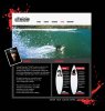
Nice! I like the white header with the picture of the surfer beneath it since it tells you instantly what the site's about. Though I'm a little concerned about how this would look in a browser window, seeing as how far it is between the top of the page and the part that contains the text. If you scrunch it vertically a bit and lighten up the body color (I mean, it's surfing after all) it should come together nicely! ")
I agree with ian in regards the banner image, from an accessibility point of view the user would have to scroll down on every page to see the content thus annoying the user and resulting in them leaving............and none of us want that do we
But there's a fine line between a cool looking design and an accessible design. Generally you should try hit somewhere in the middle, don't ask were this line is as it changes with every website Depends if your main focus is on design or accessibility! Seen as though this is a surfing website I'd say design would be your main ideals.
Kudos on the design by the way i like it.
But there's a fine line between a cool looking design and an accessible design. Generally you should try hit somewhere in the middle, don't ask were this line is as it changes with every website
Depends if your main focus is on design or accessibility! Seen as though this is a surfing website I'd say design would be your main ideals.Kudos on the design by the way i like it.
marktaylor
New Member
Re:
Wow!! looking great layout..however it will use in flash on wave and surfer are motion on way...
Wow!! looking great layout..however it will use in flash on wave and surfer are motion on way...
Your business website is your office on the web where you will do your business. In fact it needs to perform many functions. It’s got to be store front, reception and salesperson everything.
It would become reflection of your business, the quality of your product, and your brand.
Therefore, your website should look professional and well done. It does not need to be fancy, flashy and expensive though. All that your site requires is a clean design, a simple layout and it should be well-structured and easy to navigate.
A simple exercise that would help you to differentiate between good and bad web design is to surf and browse the sites in your niche.
There are some websites which would appeal to you and you would like to stay longer. And there would be others which you would like to run away from.
You just know when you see a good page, and a bad one.
Analyze the pages. Note what you like and what you do not as you surf. Identify the problems and note them down.
Take a special note of the big professional websites are doing.
Most of them would have a simple layout!
While creating products we had kept into mind people’s needs. While creating website we must take into account the surfing habits of people. On internet, the people mostly come to search for the information. Most of the information is text based. If a fancy page has no information or substance, it delivers no value.
With these things and your research in mind, here are few other important points that you must take into account while planning your website design.
* Keep page size as small as possible. This can be achieved by using smaller and minimum graphic files i.e. using a small logo, and images only if absolutely necessary.
* Maintain Consistency throughout the site. Keep the same font throughout. Your website should bear same or similar look throughout the page and every page. Different colored background for every page is kind of unprofessional.
wetgravy
New Member
instead of using the red blotches in the corners (which look like a blood brush pack from deviantart.com) ... use the waves and water to extend past the borders in a creative way (using masking) and i would also make the surf image smaller or make the logo and nav bar part of the image to reduce scrolling and loading. Also your design appears to be 3 distinct parts that don't mesh well. (red blotches aside) you have a bright white banner type header that is really minimal in appearence, an energetic splash image and then the content of the site is textured grey background frames around black background content areas. I would try to make the appearence seem more cohesive.
Looks good so far though.
Looks good so far though.