Hi there
I'm a noob at coding but will have a crack at anything
At the moment I really need your help.
I have a menu that I've designed at the moment but I want to replace it with a new cleaner, simpler design.
(At the moment it is a colourful flash menu but very busy)
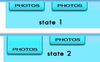
What I'm trying to do now is to have the menu work so that when a button is moused-over the image pops down a bit so it sticks out from the rest of the menu.
~(almost like a dropdown menu, however it is just the button that pops out)
I've got two elements to the button which is the button (Lower.png)
and the bit that I want to appear and push the button down (Upper.png)
so that it is essentially like a tab that sticks out.
I tried various combinations of mouseover but the problem I found every time was that I would need to recreate the code for the elements every time to create a new button AND create multiple different lower-parts with the name of each page linked (Home, Photos, News etc...).
Also I don't think its efficient to use the entire code for a popdown MENU when all I want is the buttons to pop down by theirself with no extra links, when its rolled over at least for the moment.
Diagram:
--v------
I think I will be able to tackle the automatic creation of page buttons when I add a new page to the list. What I was thinking was some kind of PHP program + GD to dynamically create each menu button from a pread external url list. I have a similar thing with a gallery that pulls its info-section for each photo from the list.
or I was going to create them in in CSS somehow so the text is available for spiders as well.
Any help or ideas?
Any info that you need me to supply if I haven't explained it properly?
Thankyou!
EDIT: I've been looking around and still finding that all the rollover tutorials require the images to keep their constraints. Can't find a single one that juts out of its original position.
Last edited:


