dementedde
New Member
Hi,
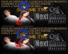
I’ve created some graphics for my website. I’ve mixed them in with a mock-design of the sites layout to give you more of a visual idea of how they will look on it.
Please give me your professional opinion on how they look. Any positive or negative feedback is welcome. Please see if the overall design suits the layout, the models in the graphics suit the graphic, the colours match, and the text is readable etc.
Here are the links;
http://i217.photobucket.com/albums/cc264/dementedde/rev.jpg
http://i217.photobucket.com/albums/cc264/dementedde/rev2.jpg
http://i217.photobucket.com/albums/cc264/dementedde/winner-reviewer.jpg
Thanks.
Rickie