The first thing I noticed is the sliding menu on the left hand side. I don't like this.. My default view was with the 'How can I help' section expanded, and when I went to click on Portfolio in the menu, it slid up and moved the link on me. I found this irritating.
Also, any chance of seeing the portfolio images larger? It's hard to look at the details put into your work if I'm only looking at a small image. Another thing in the portfolio, making the page buttons actually buttons, so the area around the number is also part of the link. I had the impression from looking there, that they were in fact buttons, and that I could just press inside the rounded square anywhere, which would make it very easy to click on, however this isn't the case, it's only the text that I can click on, which is much more difficult (in comparison).
In the web development portfolio, I would personally make the links to your works open in a new window. Personally, I would like my website to stay open, and not get accidentally closed, nor make the user have to hit the back button multiple times to get back to my site.
The 'Who I Am' section, I would suggest placing a photo of yourself. Show a smiling face, make people feel more welcome, and it will allow people to emotionally connect with you easier, and therefore get you the job.
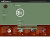
The last page I checked out was the contact page. I'm using chrome and it didn't display properly for me. You can see how it was displayed in the attached image.
Lastly, put random numbers/letters into your address bar:
http://antoinette.ca/?page_id=HERE
see what happens.
Hope that helps
")
.
Denno