Hi,
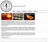
Check out my page design, im in the middle of structuring it at the moment. I reckon the colour scheme will be the dark green and cream from the "Natural Range" image, with maybe a red/orange/yellow colour to contrast. Im thinking that maybe my nav bar and footer are too big, and maybe I should get rid of the curved corners.
The right side content will have an image map for locations of outlets on top in the bigger space and maybe an advert for a product they want to push forward on bottom. This should balance it off.
What do ya think of this? Does anyone have any good ideas to enhance this?
See screen shot