New website design.. comments welcome

helloworld

New Member
Whats up forum?!
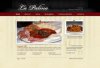
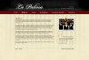
I'm kind of posting this late in my development process, so I can't realistically make any major design changes at this point.. just curious what you guys think of this.
The hard lines at the sides of the header, and the footer nav font in the subpage have been fixed already.. my monitor was really dark apparently..
It's for an Italian restaurant in NY.
cheers!
 

Attachments

  • home-final.jpg
    home-final.jpg
    93.9 KB · Views: 112
  • subpage-final.jpg
    subpage-final.jpg
    96.3 KB · Views: 110
Last edited:

anna

New Member
I think it's nice, clean and simple. The only suggestion I would make is to break the address into two lines, instead of one.
i.e. Phone number on one line
Street address on another
City, State, Zip on the 3rd line.

Other than that, good job! I liked how your testimonial (obviously unfinished) said "reputable source" :D That was cute.
 

helloworld

New Member
hey, thanks for the quick reply..
I had considered this, but it looks much better on one line with the phone number above it. Also, the address will be on the contact AND location and directions pages as well, so I don't think it will be a problem.

update:
I'll post a link on here when its built out. I'm not happy with the jpg compression on these once I uploaded them here. The nav is actually much prettier..
The contact info on these is accurate btw if anyone is in NY.. the food looks badass!
 
Last edited:

ronaldroe

Super Moderator
Staff member
Hell of a design. As long as it's coded as clean as it looks, you're on the right track. :)
 

bcee

New Member
Beautiful! Love the texture, colors and type. My only gripe is the white outer glow around the logo. Outstanding work.
 

d a v e

New Member
very nice! could do with a tagline to say what sort of restaurant is - either nexdt to logo ot above address
 

Phreaddee

Super Moderator
Staff member
it is always nice and refreshing to see a nicely polished site like this.
it loaded fast. is easy on the eye. I like the submenu too and I normally dont like dropdowns but that is a very tasteful one. good work.
let us know when its live. would love to see the final work.
 
Top