jadawgis732
New Member
Hi, I posted here a few months ago, to get some info on what was wrong with my dad's site.
http://www.webdesignforum.com/7628-wondering-what-language.html
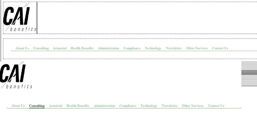
Now he's given me the go ahead I'm attempting to do a redesign, and I've learned some stuff, but learning as I go. I am using dreamweaver. So, I have opted for a horizontal nav bar using CSS, and this is what it looks like:

What is wrong with my design? I know if I were to go horizontal, the square logo makes my life difficult, What would you guys do, and if you think I can make horizontal work what line of code do I need so that I can put a container to the right of the logo. (I was thinking logo top left followed by the nav bar.) It's not a lot of content on the site, but there may be too many nav choices for a site of this type.
http://www.webdesignforum.com/7628-wondering-what-language.html
Now he's given me the go ahead I'm attempting to do a redesign, and I've learned some stuff, but learning as I go. I am using dreamweaver. So, I have opted for a horizontal nav bar using CSS, and this is what it looks like:

What is wrong with my design? I know if I were to go horizontal, the square logo makes my life difficult, What would you guys do, and if you think I can make horizontal work what line of code do I need so that I can put a container to the right of the logo. (I was thinking logo top left followed by the nav bar.) It's not a lot of content on the site, but there may be too many nav choices for a site of this type.

