afitzgerald
New Member
Hi Guys
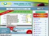
I would appreciate some feedback on our recently relaunched and rebranded website Nova Car Hire.
I have attached a screenshot of the previous design so you can compare and contrast. Basically we have introduced a new mascot in order to enhance the memorability factor for our customers. We have also focused on our USP's across all landing pages..
What we really wanted to get across to our customers is that we are a car hire broker as opposed to a supplier, something we have also tried to get across in the design.
I look forward to hearing any feedback on the site design both positive and negative. What can we improve on or add to make the site better.
Thanks for your time
Aidan