You are using an out of date browser. It may not display this or other websites correctly.
You should upgrade or use an alternative browser.
You should upgrade or use an alternative browser.
Does this logo go well with my site.
- Thread starter msacco
- Start date
JackDalson
New Member
Re:
Hi,
It's Good! I think this is not mismatch, you can go ahead with this.
Hi,
It's Good! I think this is not mismatch, you can go ahead with this.
JMCDesigner
Member
I think the logo would look ok using the existing colours. Having contrast in design is a good thing.
smoovo
New Member
Beautiful
I'm definitely with you. It will give your website a powerful look... Go with it.")
____________________
SMooVo- Web Design
[email protected]
www.SMooVo.com
I'm definitely with you. It will give your website a powerful look... Go with it.
____________________
SMooVo- Web Design
[email protected]
www.SMooVo.com
Doesn't really work with your site, but then again I am not sure there is a consistent enough look and feel to begin with.
I am in the same boat...why do you want this logo? because it looks cool? or is there some underlining reason? Ideally you need to develop a theme for your site. This is established through font choices, color, graphic style, etc. You shouldn't add a logo just for the pure sake of it.
give it a try I think it would look nice but for sure dress it up some to look like your own
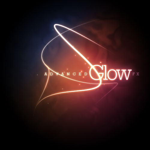
The "Advanced Glow FX" logo is from a tutorial on psdtuts+...I know because I have tried out the effects myself. A lot of fun, looks cool. Here is my version:

My two cents...
Give the logo a try. It couldn't hurt to learn the Ps glow techniques anyway right?
However, you do need to work on your website layout/theme. Simply dropping a logo like this in the top of your site will definitely throw the balance off. Once you get a solid concept down, things seem to fall into place more easily.
SplitElement
New Member
Great graphic. You did well with the glow and aurora theme. However, the font doesn't match. It looks like a font that would be used for body copy. I suggest a sans serif font, or either a display font with serifs.
dub_designer
New Member
OP....what logos come to mind when I say "Fortune 500 Company"? They most certainly don't look like that. Think of epic logos that have sustainability: City, UPS, Coke, Nike, Addidas, Fedex. They are clean, simple logos with just a hint of hidden meaning.
Though that logo has flair, logos' should have meaning and simplicity, offer a clear and concise meaning as to your product or service, contain projectable sustainability, and be easy to reproduce. Will you ever print in black and white? Will you ever fax something with your logo on it? Gradients won't work over a fax / copy machine.
That logo has graphical elements that go all over the place....those lines aren't what you want with for website that sells phones. It works, to a degree, with what is says..."Advanced Glow Fx" because it looks like a glow stick / light flying around.
Perhaps you should hire a freelancer who knows what their doing. They listen to your wants, your likes and research what you need. Then hopefully come up with a design that meets your needs and wants.
SEOArbiter
New Member
I really like it...great work. Very creative and eye-catching logo!