Mr. Picky Logo

Fireproofgfx

New Member
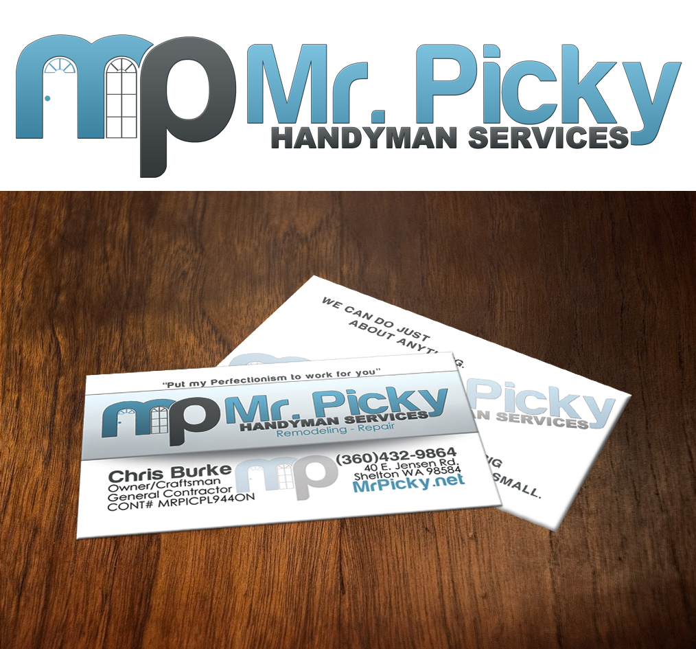
Here is my latest Logo and Business Card design that I made for my Brother in laws business. This is the first draft.
mr__picky_logo_by_fireproofgfx-d4si096.png
 

d a v e

New Member
i like everything! assuming the window bit works at small enough sizes

kern the 'i' and 'c' in picky - they're a bit too close

good job though!
 

Phreaddee

Super Moderator
Staff member
daves right, the spacing between the i + c is too close.
also (and just being picky) id work with the "handyman services" to line up with the M, and possibly not as close to the y, but overall...
i think the logo should work at low res b+w no dramas, so thats good...
i like the logo on the white but it feels a little washed out on the BC design. not sure on the gradient/dropshadow
 

abd_webdesign

New Member
Given you'll do all those suggested above, then you'll be fine. It's a job well done! :)

I concur with the other posters. You could also try resizing the mp that's by itself. I'm not sure I like it bigger than the other text. Just my two cents. :)
 

Fireproofgfx

New Member
Yeah for finalizing the logo, I did what everyone stated and I also shrunk the MP down to match the other text. Thanks for the CnC
 
Top