Personal Logo Critique

PixelPusher

Super Moderator
Staff member
I have been working on a new logo for myself as a freelance designer. This is one of my favorite concepts I have composed so far. Figured I would see what you all thought.
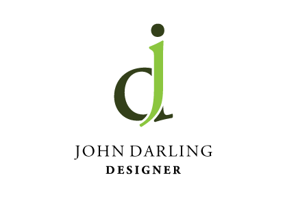
john_darling_logo.png
 

DHDdirect

New Member
I think it's excellent. Very well done. Short of sounding like a broken record (does anyone remember records in this forum?) the design is simple and can easily work well in any media format.

Have you tried removing the dot and extending the J a bit higher? I think I prefer it as is but I wanted to offer other suggestions. Your choosen text is perfect as well.

Being someone that uses AI, have you created it in Illustrator?
 

kohncreative

New Member
I like the simplicity of it and how the letters work together. My only concern is that I read dj not jd. Not really a huge deal. Overall I like it.
 

anna

New Member
I really like it, too. Maybe try switching the colors around to see if that draws the user's attention to the "j" first?

I personally saw the "JD" right off, but when the other person said they saw "DJ" I could see where they were coming from.

Either way it's a great logo!
 

PixelPusher

Super Moderator
Staff member
Thanks for the compliments and suggestions everyone. Yeah this way developed in Illustrator. I do all logo design in AI, there isn't another app that can top it :)

I will make a few adjustments based in your comments and post a new copy.
 

Knightmare

New Member
I like the color scheme. It fits well, even if unintentional, with the "Go Green" initiative that is being adopted by a lot of businesses. I do not know why, maybe it is just color, but I look at the logo and that is immediately what I think of. Looks sort of leafy I suppose.

Kudos.
 

Edge

Member
I think this logo is lovely and unusual! Well done. Is the graphic centred above the text? Am sure it is, but looks a bit to the right.
 
Top