Spacing out the links in my nav bar

jeanm

Member
My site is very simplistic but I refuse to "go fancy" until I understand every step of what I'm doing first. I don't want to copy html from other sites if I can't understand all of it. "Fancy" will come later, I hope ;)

I'm having trouble with my nav bar. I can't see how to move the various links further apart from each other.


This is the code I have used in the CSS:

div.navigation
{
height:50px;
padding:0.5em;
background-color:#87870D;
color:#FFF6E6;
}


I have a page called navigation.php and this is the code:

<a class="navigationtext" href="../index.htm">Home</a> |
<a class="navigationtext" href="../railway-trip-ghan.htm">The Ghan</a> |
<a class="navigationtext" href="../railway-trip-trans-siberian.htm">Trans Siberian</a> |
<a class="navigationtext" href="../travel-information.htm">Travel Information</a> |
<a class="navigationtext" href="../useful-contacts.html">Useful Contacts</a> |
<a class="navigationtext" href="../travel-journals-blogs-articles">Travel Journals</a>


This is the code I have on the actual page:

<div class="navigation">
<p style="text-align: center;"><?php include ("navigation.php"); ?></p>
</div>


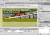
When I look on the page in design mode the links are there but they are jammed up together too much. How can I separate them please?
 

Denno

New Member
Pretty sure the padding is only on the inside of the DIV.

You will need to add CSS styling for the <a> tag, giving that padding. You may want to remove the set height whilst you're testing too, that way things can expand as they wish, then you get a better understanding as to where they will go.
But definitely need to style the link tag with some padding.

Hope that helps
Denno
 

jeanm

Member
I decided to do it properly and go with a list for the nav bar and all has worked well except the text is now sitting a bit below the actual nav bar. I've been through the code so many times but I can't solve the problem. Could someone please tell me what I've got wrong. The CSS is:


h1 {font-family: arial,helvetica,sans-serif; font-size: 14pt; color: #54542A; text-transform: capitalize;}
h2 {font-family: arial,helvetica,sans-serif; font-size: 12pt; color: #54542A; text-transform: capitalize;}
h3 {font-family: arial,helvetica,sans-serif; font-size: 10pt; color: #54542A}
h4 {font-family: arial,helvetica,sans-serif; font-size: 9pt; color: #54542A; text-align: center}
p,li {font-family: arial helvetica,sans-serif; font-size: 9pt; text-align: justify;}


body {background-color: #D7D790; font-size: 100%; margin: 0px;padding: 0px;border: 0px;left: 0px;top: 0px;}


a:link {font-family: arial,helvetica,sans-serif; color: #54542A; font-weight: bold;text-decoration: underline}
a:visited {font-family: arial,helvetica,sans-serif; color: #6B6B00; font-weight: bold; text-decoration: underline}
a:hover {font-family: arial,helvetica,sans-serif; color: #54542A; font-weight: bold; text-decoration: underline}
a:active {font-family: arial,helvetica,sans-serif; color: #54542A; font-weight: bold; text-decoration: underline}


div.container
{
width:900px;
height:auto;
background-color:#BDBD7E;
margin-top:0px;
margin-right:50px;
margin-bottom:5px;
margin-left:50px;
border:1px #54542A;
}


div.header
{
height:203px;
width: 900px;
background-image: url(images-general/header900x203text.jpg);
background-repeat: no-repeat;
padding:0px;
margin-top:0px;
margin-right:0px;
margin-bottom:0px;
margin-left:0px;
}


div.navigation
{
height:50px;
padding:0.5em;
background-color:#87870D;
color:#FFF6E6;
}


div.content
{
width:645px;
height:auto;
float:left;
margin:0;
padding:1em;
}


div.right
{
height:auto;
margin-left:680px;
padding:1em;
}


div.footer
{
padding:0.5em;
background-color: #87870D;
color:#FFF6E6;
}


#nav {
width: 100%;
float: left;
margin: 0 0 3em 0;
padding: 0;
list-style: none; }
background-color:#87870D;
}

#nav li {
float: left; }

#nav li a {
display: block;
padding: 8px 35px;
text-decoration: none;
font-weight: bold;
color: #FAF9DD;
}

#nav li a:hover {
text-decoration:hover;
color: #FAF9DD;
background-color: #fff; }


div.image_descrip_left_landscape
{
float:left;
width: 325px;
height: 258px;
font-weight: bold;
font-family: arial, helvetica, sans-serif;
font-size: 9pt;
color: #54542A;
font-style: italic;
}


div.image_descrip_right_landscape
{
float:left;
width: 325px;
height: 258px;
font-weight: bold;
font-family: arial, helvetica, sans-serif;
font-size: 9pt;
color: #54542A;
font-style: italic;
}


div.image_descrip_left_portrait
{
float:left;
width: 246px;
height: 335px;
font-weight: bold;
font-family: arial, helvetica, sans-serif;
font-size: 9pt;
color: #54542A;
font-style: italic;
}


div.image_descrip_right_portrait
{
float:left;
width: 246px;
height: 335px;
font-weight: bold;
font-family: arial, helvetica, sans-serif;
font-size: 9pt;
color: #54542A;
font-style: italic;
}


div.advertisement1
{
float:left;
width:300px;
height:250px;
}
 

jeanm

Member
Here we go:

<ul id="nav">
<li><a href="../index.htm">Home</a></li>
<li><a href="../railway-trip-ghan.htm">The Ghan</a></li>
<li><a href="../railway-trip-trans-siberian.htm">Trans Siberian</a></li>
<li><a href="../travel-information.htm">Travel Information</a></li>
<li><a href="../useful-contacts.htm">Useful Contacts</a></li>
<li><a href="../travel-journals-blogs-articles.htm">Travel Journals</a></li>
</ul>
 

Denno

New Member
I'm not sure what the problem is?

I've attached an image of how it looks where put the code into Dreamweaver.

Can you explain what the problem is? (I also changed the font colour to black, as it's terribly hard to read the white on that background)

Denno
 

Attachments

  • delete.jpg
    delete.jpg
    8.3 KB · Views: 108

jeanm

Member
The actual navigation area is dark green so the colour looks fine in reality.

When I look at the design mode on Dreamweaver the navigation text looks perfect except it is about 3/4 inch below where it should be. I feel like it needs to be pushed up the page to sit it in the Navigation area proper.
 

Denno

New Member
Could I please see a screenshot of how it appears in your Design view, with all the other elements there.
 

Denno

New Member
When you send a reply, you need to click on 'Go Advanced' (instead of using the quick reply at the bottom of the page. Or just click on Post Reply somewhere in the thread.

You'll then be in the advanced text editor, you type your message as usual, then scroll down into the Additional Options, and press the button Manage Attachments.

From there, a new window will pop up. In the first section of that new window press the Choose File button, navigate to your desktop (or wherever the screenshot is saved), select it and press Open. Then click on the upload button in the same section of the window that popped up (not the choose file dialog).

The image will then be uploaded, you will see it above the Manage Attachments button.
Make sure it's fully uploaded before pressing Submit Reply.

Denno
 

PixelPusher

Super Moderator
Staff member
Don't rely on the Design view in DW, test it in a browser window. If you use browsers like firefox or chrome, they have excellent debugging tools that allow you to make minor adjustments to css properties and more on the fly.

Firefox > FireBug
Chrome > Developer Tools
 

jeanm

Member
Shock and horror! I've looked at it via browser and the navigation text is not in a horizontal line. It looks like a list and it spills down into the content area!

Thanks for your patience guys.

I'll attach the screen shot now.
 

Attachments

  • screenshot.jpg
    screenshot.jpg
    20 KB · Views: 30

anna

New Member
Jean, I agree with Denno, I think the white text is VERY hard to read on that light background. I would suggest, a charcoal color instead...
 

PixelPusher

Super Moderator
Staff member
Shock and horror! I've looked at it via browser and the navigation text is not in a horizontal line. It looks like a list and it spills down into the content area!

Thanks for your patience guys.

I'll attach the screen shot now.

I am gonna go out on a limb here and assume that this is not what you want :p

Without seeing your page markup and css, it looks like you have a padding issue on either the list, list items or anchors. Here is a suggestion for you. Decide what height you want the links to be and define it. Remove any vertical padding or margins on the anchors and list items. So using the previous code in this thread as an example, your css would look like this:

Code:
#nav {
margin: 0 0 3em 0;
padding: 0;
background-color:#87870D;
}

#nav li {
float: left; 
list-style: none;
}

#nav li a {
display: block;
padding: 0 35px;
height:45px;  /* THIS IS MY GUESS, ADJUST ACCORDINGLY */
line-height:45px;
text-decoration: none;
text-align:center;
font-weight: bold;
color: #FAF9DD;
}

#nav li a:hover {
text-decoration:hover;
background-color: #fff; }

NOTE: When you define the height property, try using the line-height as well. If you set them to the same value this is always place your text vertically in the middle (applies to single text only). Also there is no need to define a property in the the psuedo class (":hover") if it has already been defined in the original style. On add items you want to change/alter.

Good luck!
 

jeanm

Member
The white text looks daft because its hovering in a place it is not meant to be. When I can get it to sit in the green nav bar it will look good.

John I'll follow through on your suggestions and see what happens.

Many thanks everyone.

Jean
 

Denno

New Member
May I ask, what is the purpose of <pre> tag?

It is directly before the <ul id="nav">.

I noticed it, didn't know what it did, removed it, and the page displays fine..

so <pre> is your problem.

Denno
 

jeanm

Member
Brilliant, brilliant, brilliant!! That wretched <pre> has crept in there a few times and I don't know where it keeps coming from. I hadn't spotted that it was back again. I've changed it into a <p> a couple of times before. If things go crazy again then that will be the first thing I check out. Thanks a million Denno and Pixel Pusher - you have both helped me so much.
 

jeanm

Member
John I see what you mean about not relying on Dreamweaver's design view. What I've created works well in Firefox and IE but in the Dreamwweaver design mode the navigation text is sitting in a much lower position. I think I will not worry about it. Thanks everyone for such helpful input.
 
Top