AK Web Design
New Member
Just finished this site. It's for a fishing business in Belmar, New Jersey.
Let me know what you think.
http://www.xtcsportfishing.com/
Let me know what you think.
http://www.xtcsportfishing.com/
") .
.it's ok... but
as said above the colours are very cold.
drop shadow effect on logo is too heavy
wavy line is poorly anti-aliased
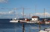
the image in the header fights with the image below it - use one or then make the other a lot smaller - actually the lower boat pic is nicer and sunny.
a lot of the images are stretched out of proportion - crop or resize them properly - not in the html, but keep them in proportion
nav bar could use some separators | e.g. | ...
verdana would be a nicer choice of font than times
resize your thumnbails properly - make them the right size and proportions in a graphics editor and optimise the filesize/quality
the photo on the contact page would be put to better use on your front page
favicon
fix code errors
nav bar could use some separators | e.g. | ...
.