First Illustrated Site

bcee

New Member
Hey all,

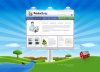
This is more of a design review than a site. I'm a raster guy, never was into illustration or anything but a project came through and I thought I would take a shot at it. The client wanted the site to look like a large billboard in the middle a field (not my idea, lol). So I did they best I can, any feedback is greatly appreciated.

-B

I still used PS with shape objects...
 

Attachments

  • home.jpg
    home.jpg
    86.5 KB · Views: 69

anna

New Member
Well, the site looks like a giant billboard plopped down in the middle of a field so, yes, I'd say you did a fabulous job interpreting the client's wishes! Looks good!
 

JerryYu

New Member
LoL, if the billboard is true, it must be the 9th wonder of the world;) it looks really great, but maybe you could change the style of the main menu, because banding style menu is too common currently.
 

BigRed

New Member
bcee said
Thanks all. Client wants more stuff now, I'll post a final version.

The giant billboard in a field is awesome it's way out there. I can't wait to see what the next project brief will be LOL, keep us posted :)
 

bcee

New Member
Yes, at first I was like huh? But it really is something to remember and that is what they wanted.
 

bcee

New Member
LoL, if the billboard is true, it must be the 9th wonder of the world;) it looks really great, but maybe you could change the style of the main menu, because banding style menu is too common currently.

Agreed 100% but they actually asked for this.
 
Top