You are using an out of date browser. It may not display this or other websites correctly.
You should upgrade or use an alternative browser.
You should upgrade or use an alternative browser.
logo feedback
- Thread starter mjclark91
- Start date

reverseengineer
New Member
I think it looks great! For me, the title might need to be arranged a little bit. I feel "Black Crow" is too big and "design" is small and kinda pushed off to the side. But thats just me!
hi
You can make the name in a circular form, with the bird at the center probably with a different colour
Hey everyone Can some of you give me some feedback on the design of this logo? It's for a web design business.
Thanks
You can make the name in a circular form, with the bird at the center probably with a different colour
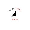

I think the "designs" text should be different from the "black crow". The icon and the text seem too separated, they need to blend together better.
I do prefer the second crow over the first one. The top hat adds a little style, personification. Its catchy and more suitable for a design company.
I do prefer the second crow over the first one. The top hat adds a little style, personification. Its catchy and more suitable for a design company.
SEOArbiter
New Member
Love the image, maybe work on the font design and placement.
Christian Gate
New Member
Here is my REMIX of your logo:

Here is my REMIX of your logo:
Concept is cool, just not sure how well it would convert to print based-media, and the "c" in crow is difficult to read. Looks like a "D". I kept reading Drow
")
SixFigureDesign
New Member
The crow image is great because it acts as an icon that represents your company when you want to leave out the words. That way, when people see your crow, they instantly think of your company.
Many huge corporations have been doing this for decades (Shell Oil, Pepsi, Carrefour, etc.) And vice-verse, when you read these names, you instantly think of their logo as a symbol.
Sandi
Six Figure Design
Many huge corporations have been doing this for decades (Shell Oil, Pepsi, Carrefour, etc.) And vice-verse, when you read these names, you instantly think of their logo as a symbol.
Sandi
Six Figure Design
LeenkzMike
New Member
Maybe use a more robust font, and maybe give it a light shadow, make it pop a little!
notarypublic
New Member
I like the idea of the crow with a top hat - any idea what the context is for that? Just curious. I've seen it before, but the connection I'm getting is that it comes off as distinguished. I think that's a good angle to take, but with that said I would streamline the silhouette's outline a bit - unkempt feathers kind of distract from that distinguished look.
leroy30
New Member
Pixelpusher the 'cVD' looks like a monkey head!
I like the crow in the silver box on pixelpushers take but I think that would be the logo placed on top of some artwork in, say, a website.
I think the crow itself needs to be tidied up so there are no small points (i.e. tiny teeny feathers).. maybe make a slightly smoother crow icon and blend it with the text better?
Besides that I think the bird is ok just don't like that text either!
digital designe
New Member
first logo looks good then second specially website design business please mention website design rather then only design.
helloworld
New Member
I'd totally stick with the second crow.. simpler design, and will scale down much better than it would with all the detail of the first. Just play around with the fonts some more.